Okay, some final words about the appearance of text in silent movie intertitles before I move on to what sometimes appears behind or around it. I’m not sure why or how the rule about quotation marks came to be for silent films, but in dialog cards, pretty much all of the time quotation marks are outside of the text margins.
This is called Roman Hanging Punctuation. Easier to execute as hand-written lettering or as type-setting, but much less common a paragraph-formatting option in computer programs. Or it was at one point.
I’d been setting the quotation marks manually as separate layers in Photoshop until someone got me hep to the name of this style, and I discovered the justification option for Roman Hanging Punctuation. I still had to raise the height of the quote marks a few points to match what I’d been seeing in titles for years, though.
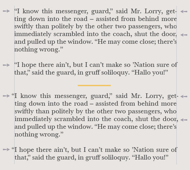
It’s quite possible that the choice to use this format for dialog title cards, as opposed to the way quotation marks were ordinarily used in print media or literature, was to assist in the ease of reading. In Silent Film, after all, the dialog is not part of a long stream of written pages. It’s inserted into a flow of live-action moving images, held onscreen long enough to be read, and then pulled off again.
Oh, and the name of that typeface you’ve seen in lost of 1920s films? It’s Pastel, and although originally created in 1901 it doesn’t start turning up in movies until around 1923. And then it’s nearly ubiquitous, all the way through the early 1930s. It was turned into a font called “Silentina” in 2004 by Ray Larabie of Typodermic.com.
The first post in this series is here.
The previous post (#26) to this one is here.
The next one (#28) is here.