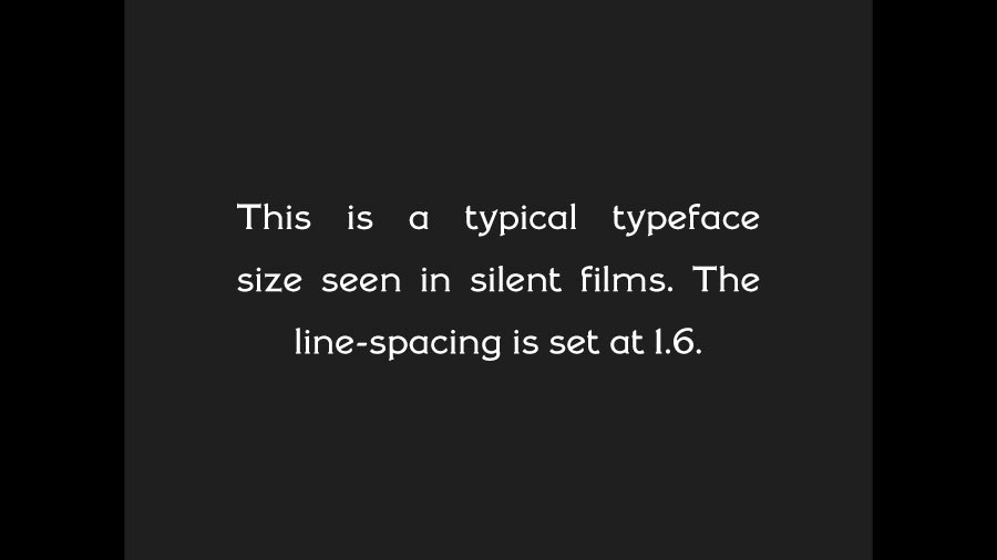
Sub-titles in Silent Film are easy to read. They have to be. They interrupt the action, throw us a bone (or two), and hop back off the screen. Along with the economy of the text and the screen-time duration, the way the text is laid out was also pretty consistent throughout the silent era.
Ask anyone in publishing, and they’ll tell you basic rules about font size, margins and line-spacing. There are loads of posts and online articles about this. I found this out when I published Steve Massa’s book Marcel Perez: International Mirth-Maker and when I did the layout for the booklet that was included in the initial run of discs of When Knighthood Was In Flower.
It’s something you notice when you have a hard time reading or tracking text in a book or a pamphlet. Or in a title card. You may not be aware of why you’re having a hard time reading, but it’s some basic scale and ratio rules aboutu type size, margins and line-spacing.
In Silent Film titles, the exact type size and line spacing may waver a tad from one studio to another, but just a small bit. I’ve re-made or made new title cards for digital editions of silents many times. My method is always to take a few frame grabs of other ones from a film from that studio and year, and create a layer in Photoshop on top of one of them, and then match the type size, margins and line-spacing so it’s exactly like what I’m seeing in the original.

What this has taught me is what I’ve seen forever, and perhaps you as well, that throughout the silent era, regardless of the typeface of hand-lettering style, these measurements pretty much hold steady from the early ‘teens through the end of silent movies. There are a certain number of words that can be a maximum number on a title card before you either have to shorten sentences or carry the text over into a second title.
But, along with the economy and style of the writing – whether it’s exposition or dialog – the onscreen text size, margins and line-spacing seems to have gotten set early on and remains the same year after year. What fascinates me is the fact that whatever these standards were, even if they were unwritten, they somehow evolved quickly and early.
They were designed for ease of reading. The only thing that changes during the ‘teens and ‘twenties are the variety of typefaces and hand-lettering styles, and what sometimes appears behind the text. These two other aspects of titling in Silent Film are the subjects of my next couple of posts.
The first post in this series is here.
The previous post (#24) to this one is here.
The next one (#26) is here.
Thanks for pointing out something important that I have completely missed. There is a science behind everything in silent movies.