If there’s one other ubiquitous stereotype people have about silent movies besides heightened or exaggerated gesturing it’s the use of title cards. It’s more true and prevalent than the face-pulling and gesticulating people assume is part of the medium, and rightfully so.
The title cards bearing text that appear in Silent Film were originally referred to as sub-titles, rather than intertitles. The second name comes to us to because we’ve grown to know sub-titles as, literally, sub titles, or titles that appear below something. We know “sub-titles” as translations of dialog that appear at the bottom of the screen so they don’t distract from what we’re watching or paying attention to.
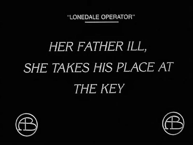
They first appeared in motion pictures in the ‘aughts to separate scenes, often only serving to announce not only the scene change but also what we were about to see happen in the scene. It may seem like overkill to us today when this is done, but these titles may have also helped the working-class audience still learning English to decode the scene that followed. Although today we’d expect the word “SPOILER” to appear at the top of these, they served to give the audience enough information without having to frequently interrupt the action to explain who everybody was, what they were doing and why. The way you would when watching a movie with a small child.
These titles, like all Silent Film sub-titles, bring us information and just enough. These “announcement”-type titles gradually gave way to ones that less blatantly divulged the proceedings that would follow. They would gradually over years come to appear within a scene to give us another hint every once in a while so it wasn’t all front-loaded at the beginning of the scene.
The use of sub-titling in Silent Film became an art unto itself, both in terms of the craft of the wording and even the economy of the word count, but in terms of the amount of information being leaked to us. There were developments in use of existing typefaces and the creation of new ones. The use of art drawings, superimposed images and textured backgrounds made their way into titling. Not just to be fancy, but there were aesthetic reasons for these developments as well as the insertion of titles when they may not really have been necessary.
The line spacing, type size, and margins also appear to have been standardized, either deliberately or through practice and trail and error.
All of these were for ease of briefly interrupting our view of the film, sharing information with us — just enough so we knew what was what but could still fill in specifics with our own imagination. In the next few posts I’ll go over what I’ve observed about the various titling techniques in Silent Film.
The first post in this series is here.
The previous post (#17) to this one is here.
The next post (#19) is here.
[email-subscribers-form id=”1″]
I wonder if developing playwright Bertolt Brecht, advocating for placards that described the action before you saw it, was influenced by silent film.
A curious question:
While I have heard that Charlie Chaplin and Buster Keaton would try to see who could use the fewest intertitles in their movies, did any director have the reputation of using way too many intertitles?
Maybe not a reputation, but I can say that Griffith’s epics have A LOT of intertitles – especially Intolerance, from 1916 – and some British films also have way too many intertitles. The 1920 adaptation of Hobson’s Choice can be perfectly understood by lip-reading, but the intertitles cover almost all of the character’s lines. The Man from Home from 1922 has a lot of them and only one murder sequence is intertitle-free- this sequence was directed by an assistant called Alfred Hitchcock.